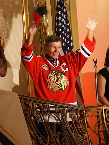
A Pro Stock Hockey Top 8 Uniform
Irene Castle, along with her husband, Vernon, were the most popular ballroom dancing duo of the early 1900s. Highly acclaimed throughout the United States and Europe, the elegant couple popularized ragtime, jazz dancing and new dance steps, including the turkey trot and the fox trot. After Vernon’s death in World War I — in a plane crash on a Texas training base — Irene continued to perform on stage and in silent films. She retired as an entertainer in 1929, and she devoted the rest of her life to her family and to animal rights issues.
You may be wondering what Irene Castle has to do with the Chicago hockey jersey. As it turns out, everything. Irene Castle — whose third husband, Frederic McLaughlin, owned the Chicago Blackhawks — designed the now iconic Indian head logo that has adorned the Chicago Blackhawks uniform since the team’s inception in 1926.
Evolution of the Blackhawks Hockey Jersey
McLaughlin named his hockey team in honor of the Black Hawk Division of the U.S. Army, in which he served during World War I. His wife’s original Blackhawks logo was a fairly rough black-and-white sketch, which matched the team’s original white and black-striped jersey. Rough though it was, its distinctiveness even then made the logo stand out.
Over the years, the Indian head design has gone through a number of updates, including the addition of color in 1935, a restyled hairdo and other tweaks in 1938, a thorough facelift in 1941, and another thorough facelift in 1959, which produced the look the world’s most famous Blackhawk essentially has today.
Why the Chicago Hockey Jersey Rocks
The Chicago Blackhawks uniform elegantly combines simplicity with complexity (much as Irene Castle did in her dancing days). The Indian logo contains a lot of colors, curves and lines, and yet remains pleasing to the eye, dramatic and powerful. The logo’s precision, warrior-like impression and the hat-tip to history are perfectly fitting for a team that plays hockey in a league with a rich history. The logo completely avoids the problem of a complicated logo (confusion) and the problem of a simple logo (dullness).
The overall color scheme and design of the Chicago Blackhawks uniform are also powerful, simple and striking. The rich red home color can be spotted as “Blackhawks red” from a mile away. Simple lines and the famous secondary logo, the tomahawk cross, decorate the shoulders. The word “classic” always comes to mind: classic red, classic white on the road jerseys — and as of 2018, the probable return of the classic black alternate jersey, which the team hasn’t worn since 2010-11.
The tomahawk cross, by the way, has also undergone a number of design changes over the years — 16 to be exact. Currently, the tomahawks appear on the red jerseys in yellow, green, white and black; and on the white jerseys in yellow, green, white, black and red. The ever-so-slight sprinkle of color lends even more strength to the overall Blackhawks uniform look.
A Fan Favorite, for Sure
Now again you may be wondering whether Pro Stock Hockey, headquartered in Chicago, may be a bit biased in selecting the Chicago Blackhawks hockey jersey as one of its Top 8 picks. Well, whether we’re a tad biased or not, we can give you about 6 million other reasons why the Blackhawks jersey belongs on the list.
In 2017, an NHL poll that attracted 6 million votes resulted in the current (1959-present) Blackhawks uniform being picked as the Greatest NHL Uniform of all time. The fans have spoken, and who are we to argue?
(Image Credit – Wikimedia Commons)
