The L.A. Kings vintage jersey was a royal mix of gold and purple, a unique combination in the NHL. The Kings wore them from their inception as an NHL expansion team in 1967 until 1988-89. For its originality and bold design, the L.A. Kings old jersey makes our list of Top 8 NHL uniforms. Take a peek:

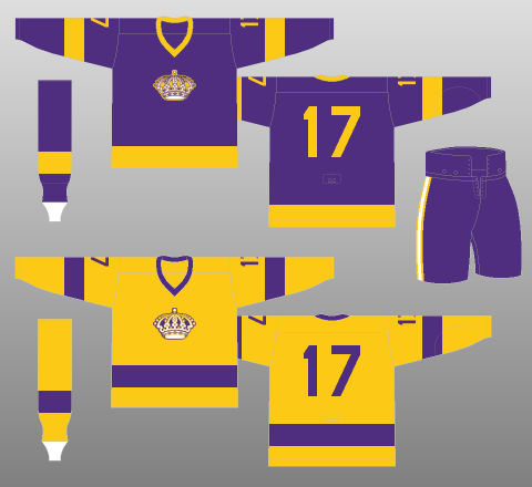
1967

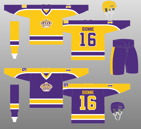
Figure 1 1980
The rollout version of the L.A. Kings throwback jersey has minimal design elements: a king’s crown logo on the front and player number on the back. By 1980, player names had been added to conform to NHL regulations, and striping had become a tad more intricate. In 1980, contrasting color across the shoulders and sleeves gave the jersey quite a different look without losing any of the essentials.
Interestingly, the Kings’ primary logo, a hanging banner with the ornate crown and the words “LOS ANGELES KINGS,” did not appear on the uniform. However, with the unique colors and large crown on the jersey front, fans in any NHL arena could easily figure out the Kings were on the ice. This immediate recognition factor is another terrific design strength of the L.A. Kings vintage jersey: Like the McDonald’s golden arches, you can spot a Kings uniform a mile away without any identifying text.
How to Cooke Up a Great Jersey Design
The inspiration for the L.A. Kings purple jersey came from two sources. First, gold and purple are colors traditionally associated with royalty, making them ideal for the regally named new team. Second, the color scheme matched that of another Los Angeles team, the L.A. Lakers. Coincidence? Hardly. At that time, both teams were owned by Jack Kent Cooke, a Canadian-American businessman who also had an ownership interest in the Washington Redskins and later became that team’s majority owner. In case you’re interested, Cooke paid $5 million to purchase the Lakers and paid $2 million to the NHL for the Kings franchise.
After 1988, ownership of the Kings changed hands from Dr. Jerry Buss to Bruce McNall. A lot of things changed for the franchise at that point. The most notable changes were the acquisition of Wayne Gretzky from the Edmonton Oilers and a complete overhaul of the Kings jersey. The new color scheme was silver and black, and the primary logo got a sleek new look. Gretzky and his wife, Janet, were the first people to be seen publicly in the new jersey, at the press conference where The Great One was introduced by the Kings.
Ups and Downs in Purple and Gold

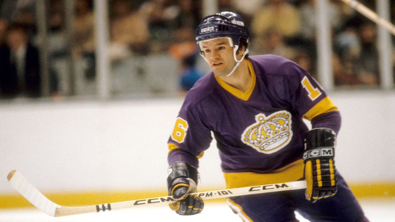
Marcel Dionne
While the Kings have enjoyed a great deal of success in recent years, including Stanley Cup wins in 2011-12 and 2013-14, they had plenty of struggles early in their franchise history. The team had 15 head coaching changes between 1967 and 1988. The team’s first five regular seasons turned out this way:
- 1967-68: 31-33-10
- 1968-69: 24-42-10
- 1969-70: 14-52-10
- 1970-71: 25-40-13
- 1971-72: 20-49-9
The team’s fortunes improved considerably in the mid-1970s, after it acquired center Marcel Dionne from the Detroit Red Wings. He, along with Dave Taylor and Charlie Simmer, formed the “Triple Crown Line,” one of the most productive scoring lines in NHL history. As a result, the Kings started winning more games, but unfortunately were eliminated in early rounds of the Stanley Cup playoffs year after year.
Through it all, Kings fans continued to support their team, and their patience eventually was rewarded. The team reached the Stanley Cup Final in 1992-93, went through another drought, and then, as we mentioned, became a dominating team in the 2010s.
(Image Credits: Uniform images from the Unofficial NHL Uniform Database . Marcel Dionne image from NHL Trade Rumor.)
